

3 mistakes you might be making with email design
There’s an art to creating an email that your customers will want to open and read. With the ever-increasing number of businesses investing in email marketing, your messages need to stand out. And while following tips on email best practices can help maximize the effectiveness of your campaigns, sometimes it’s the little design mistakes that wind up sending your email straight to “unsubscribe prison.” Here are three key mistakes to avoid when designing your next email.
1. Hard-to-read font size, style or color
You want your customers to be able to read your email with ease — no one should have to zoom in and out or squint to view your messages. And now that most emails are read on smartphones or tablets, it’s more important than ever that content is legible on every device. To make sure you’re getting your message across to customers, keep these font formatting guidelines in mind:
- Body text should be a minimum of size 14 font
- Keep fonts simple, consistent and web safe – not just within a single email, but also in all of your follow-up emails.
- Use no more than two different typefaces – one for headlines, the other for the body of your email.
- Avoid script-like fonts in the body of your email, as they’re usually harder to read.
- Keep font color simple and dark, such as black or dark gray against a white background. Lighter colors make for tough reading. Save your brighter, richer colors for your call to action buttons.
- Avoid text on top of a patterned background
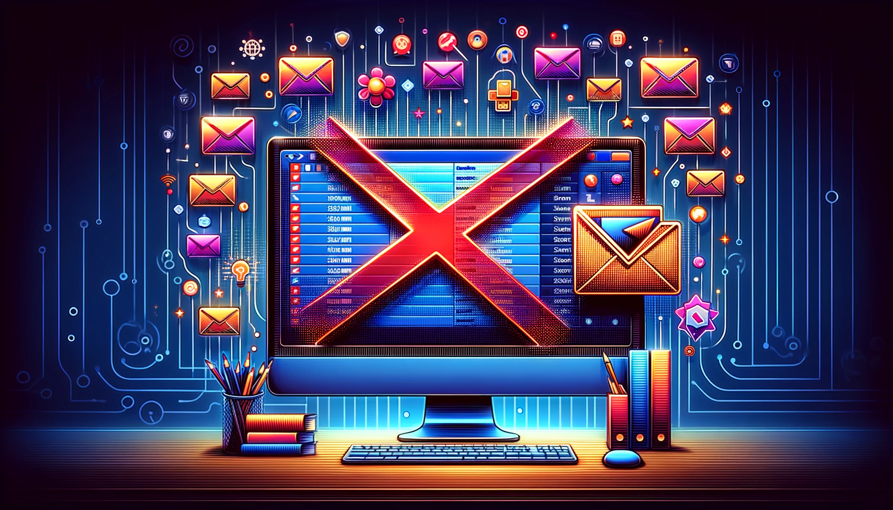
2. Complex or confusing images
Compelling imagery grabs your readers’ attention, but you don’t want to use an image that’s going to overpower your content or potentially distract or offend your customers. Keep your images simple, relevant and fun.
You should also avoid images that could be puzzling or confusing. You don’t want your customers to stop and wonder why the image is there or what it means. Consider your audience when making your selection. If the image is referencing something specific or topical like a meme, take a minute to make sure the majority of your audience will understand the reference. You’d hate to use an image that unintentionally alienates a potential customer.
3. Inconsistent messaging or templates
If you continually change the look, style and voice of your messages, you run a high risk of confusing customers and possibly having them unsubscribe. Naturally, your subject line, headline, body copy and images will change with each campaign, but elements such as your company logo, color scheme, tone and the location of your contact information should remain the same from email to email.
Ensuring that your emails are consistent is easy with an email editor like the one VerticalResponse has. Simply customize the layout to fit the branding and style of your business, then save the design for use in future emails. Though you may find it necessary to make minor tweaks to your template to keep your campaigns fresh, there should be recognizable elements in every email. Without consistency, loyal customers may receive an email, glance at it, then unsubscribe from your mailing list without realizing it’s one of yours, simply because at first glance it looked nothing like the last several emails they’d received.
Keeping these common mistakes in mind the next time you draft a marketing email will help decrease unsubscribes and increase loyal customers who engage with your content. Often, it’s the simpler emails that get read, and the consistent styles that retain readers.
Join 140,000 small business owners
Editor’s note: This post was originally published in August 2013 and has been updated for relevance and accuracy.
© 2018, Contributing Author. All rights reserved.


 Features
 Pricing
 Partner
 Blog
Blog Support
 More
More Terms of Services
 Privacy Policy
Some great points. I think consistency from week-to-week / month-to-month especially is an aspect where some tend to forget that the audience isn’t half as ‘in the know’ as you. It’s better to keep things plain then test launches of new layouts / designs / themes when they’re ready. If you can’t commit to an email design, your audience will find it especially difficult 🙂