

Successful Small Biz Marketing: Revzilla & The New Wheel Stay Consistent, Get Noticed
There are so many options today to market your business — your website, email marketing, social media marketing, Facebook page, postcards, store signage, events and more. Even your business card is a marketing tool. Whether you market your business offline or online, consistency is the key to being remembered by your customers or prospects.
Your customers get exposed to marketing messages and images not only from you, but also from your competition. People are bombarded with advertising everyday and they can only remember so much (not everyone has a Sherlock Mind Palace). So, you’ve got to be memorable by being consistent.
This post showcases two small businesses who do an excellent job of remaining consistent in both their online and offline marketing tactics: The New Wheel, an electric bike business based in San Francisco, and Revzilla, an online retail store that sells motorcycle gear. Let’s learn from example:

Using your logo in all your marketing mediums is a no-brainer. If you don’t have a professionally designed logo, you can easily get one that’s affordable and will set you apart. Use it everywhere you market yourself. Above are the logos for both The New Wheel and Revzilla. Notice the wheel/gear icon place in the middle of both logos. You’ll see this gear used throughout all of their print, social media, event and website marketing materials.
Beyond the logo, here are few tips to keep in mind for visual consistency:
1. Use an simple color scheme and complementary colors.
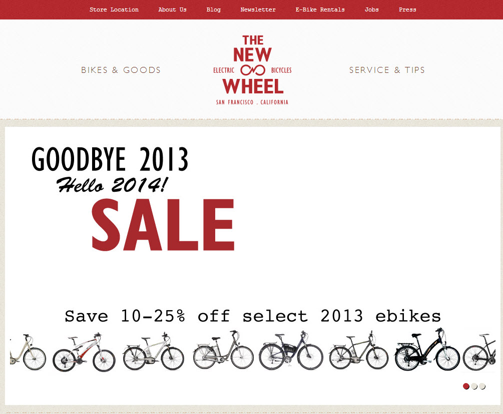
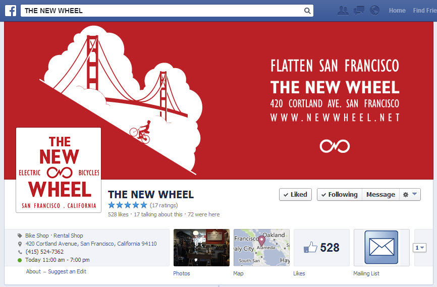
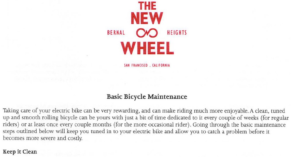
From their business card, website, Facebook page, and even a customer “how to” sheet, The New Wheel uses red as their primary color, using off-red, brown and black as complementary colors that don’t clash or distract from the message they’re trying to get across.
Here are examples from The New Wheel’s business card, home page, Facebook page and customer “how to” information sheet:

2. Use a limited number of fonts
Make sure your design isn’t a visual assault on the eyes. We’ve all seen websites or emails with so many colors, different size and style fonts, or even flashing words that drive you to look (and click) away as soon as possible. Select the font style and colors that work with your logo and stick to those across all your marketing materials.
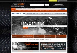
Revzilla sells a wide variety of motorcycle clothes and accessories and, yes, they do want to draw attention to promotions they have going on their site. However, they’ve done it in a way that’s organized and not overwhelming by selecting colors and fonts that don’t compete with each other.
3. Stick with your design choices across all digital marketing and print materials
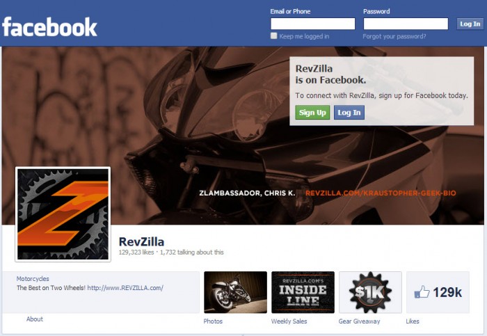
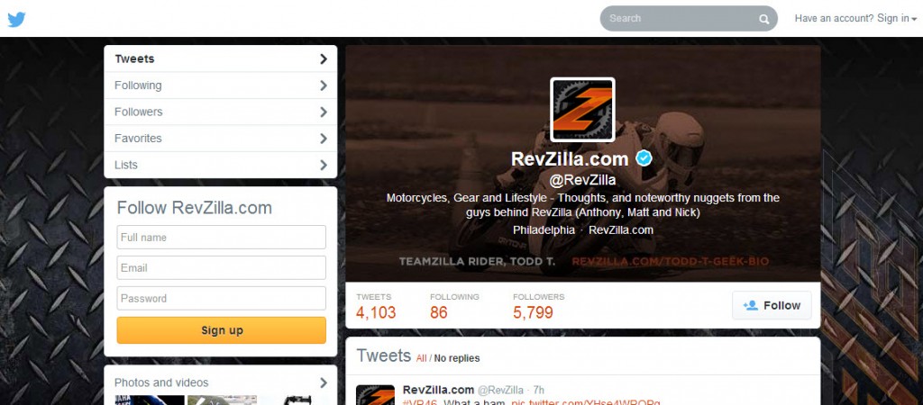
Check out Revzilla’s Facebook, Twitter, Instagram, Google+ and YouTube pages. The pages aren’t duplicates, but you can clearly tell they’re all from the same company given the logo and color schemes. Revzilla also keeps that steadfast use of their logo and color scheme in any email marketing they send out, as well as a card you find in a box when you open up your new motorcycle helmet.


4. Integrate online and offline marketing
Based on the examples above, suppose you’re at a festival and see the red tent (in the picture below), but you’re not close enough to read the text. Guess whose booth it is? It’s The New Wheel’s! This is easy to tell from the color scheme and the uniform use of the wheel gear icon (and the electric bikes sitting out front, don’t hurt either!).

Whether you use all or just a subset of these offline or digital marketing techniques, you need to be consistent. Use your logo, colors and fonts to get noticed and stay noticed.
What other tips would you add? Share in the comments.
Want more marketing tips and tactics? Sign up for the free VR Buzz.
© 2014, VerticalResponse. All rights reserved.


![Open AI vs Claude: What Small Businesses Need to Know for Smarter Email Marketing [2026]](https://verticalresponse.com/wp-content/uploads/2026/03/a7d5a329-9653-486e-af92-d645f63d8b64-1.png)


 Features
 Pricing
 Partner
 Blog
Blog Support
 More
More Terms of Services
 Privacy Policy