
Don’t Let Your Email Look Defeated – 3 Essential Design Elements
I had my first email marketing gig back in 2008 for a major reference and research library in Melbourne, Australia. With a background in print and online journalism, I was asked to create the library’s very first email newsletter. “I got this!” I said. But when it came to designing the email, “got it,” I did not.
Email service providers and the tools they offer have come a long way since 2008. There are pre-made templates, most of them customizable including drag and drop editors, and more. It’s much easier to achieve something that resembles a professional email with out feeling completely defeated.
While it’s easy to take an email template and run, it’s also important to look at it from a design point of view to make sure the content looks great too. Give your email a good hard look and ensure that your email design doesn’t look defeated either. With the popularity and emphasis on stunning online visuals, (ahem, Pinterest), sleek design rules the web and people’s attention. With that, here are 3 easy elements you should always include in the design of your email to ensure “you got this!”
1. (More) White Space
White space can seem like a waste of space, but guess what? It isn’t that awkward silence you fear experiencing on a first date. White space is your wingman, and you should rely on it to make your messages look good.
White space, also known as negative space, is the area you see between various elements in your email that’s left blank. It allows people’s brains to interpret, scan and break down content into easy-to-read info.
You know when your images or text line up right next to the edge or column of your email? That’s like breathing down a potential romantic interest’s neck. Back up my friend! Give a guy/girl some space. It’s tempting to fill up all your valuable space with info, but that clutter really turns people off – Especially if they’re reading your email on a mobile device.
There are two types of white space you should include in your emails, particularly the first:
A) Active White Space – Intentional space placed to emphasize aspects of the email and encourage eyes to read from one element to another.
B) Passive White Space – Space around the edges of your email and content, as well as empty sections inside your content.
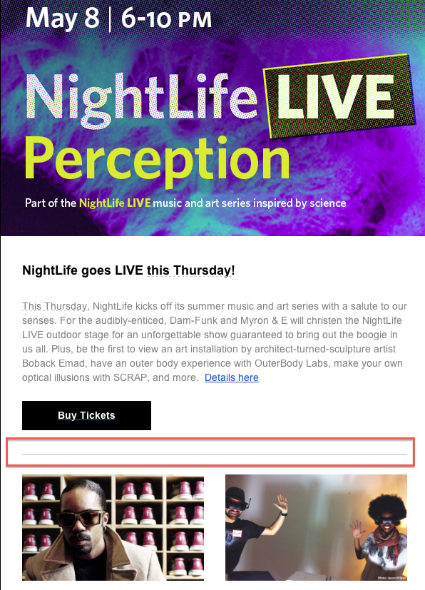
In this Pinterest email example, all of the sections highlighted in red are examples of active white space – They’re intentionally included to emphasize the images, headline, the individual sections, as well as lead people’s eyes to a call to action button or logo. The green sections highlight passive white space.
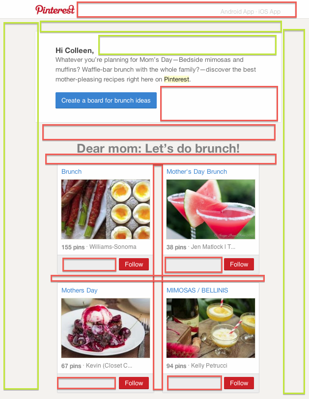
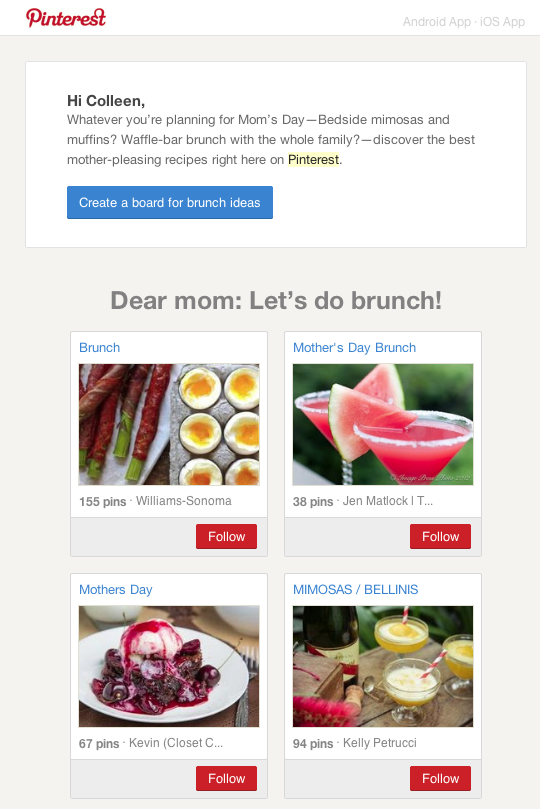
Here’s the original for reference:
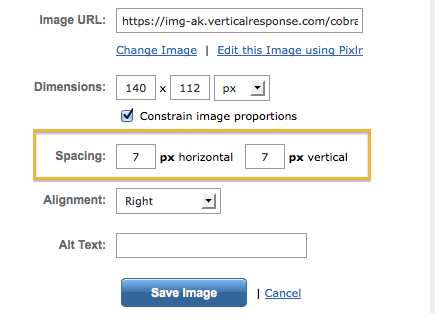
Most image editors allow you to add spacing around images so they don’t line up right next to an edge or get too close for comfort next to content.
2. Lines
There are a couple of reasons why people stand in lines: They create order and organization. Nothing’s worse than 50 people crowding an open train door all at the same time. Chaos ensues and you don’t know which way is up. The same goes for your email. If you don’t separate your email content or sections with clear, clean lines, people will see your long, crowded, clump of an email and turn back the way they came.
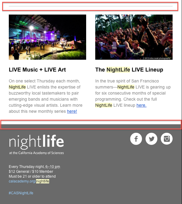
Separate every section of your email with lines. They can be subtle and small, strong and thick, appear as sections separated by color, or appear as our friend, white space. Check out this example from the California Academy of Sciences Nightlife. They separate each section with lines, use white space to separate piece of content within those sections, and even use color to separate sections.
3. Sans-Serif Fonts
Fonts are fun. I love scrolling through dafont.com and searching for the wackiest, coolest, funkiest fonts out there, but alas, a lot of those fonts just don’t fly in the body of an email. Why? Serif fonts – Those that include little loops or curls at the end of each letter, tend to look jagged, fuzzy and pixilated on a computer/phone screen.
Sans-serif (Times New Roman, Courier New, Arial, etc.) have small or zero curves known as “serifs” at the end of their letters, and appear much cleaner on the web. According to an article by the International Academy of Design & Technology (IADT), serif font is used often in books and tends to be better for long copy, but guess what? You definitely shouldn’t be including a book’s worth of content in your email! Short, brief paragraphs and headlines should make up your email body.
“Sans serif fonts are more suitable for headlines and short copy because they are better at catching attention. They are able to stand out because they are seen as bold and modern, as opposed to serif fonts which are usually considered more traditional and familiar.” – IADT
Designers’ favorite web-safe sans-serif fonts:
- Arial
- Tahoma
- Trebuchet MS
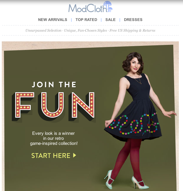
Using sans-serif doesn’t mean your email has to be boring, though. If you want to spice up your font flavor, use (one) fun one to enhance an image:
If you’re feeling adventurous and want to scour design sites, here are a handful of favorites from various online designers. If you’re into keeping up with the times, here are some interesting design trends of 2014 compiled by Shutterstock as well. Just remember that if the font is really unusual, your readers may not have it on their computers and won’t see it. If you really love the font, try using it on an image so that everyone can see how cool it is.
- smashingmagazine.com
- dribbble.com
- behance.net
- designmodo.com
- awwwards.com/blog
- creativemarket.com
- webdesign.tutsplus.com – Good for beginners
- tympanus.net/codrops
- tutsplus.com
- coverjunkie.com – Magazine covers are always great for inspiration.
Now, have you got this? Okay good!
Want more marketing tips and tactics? Sign up for the free VR Buzz.
© 2014 – 2018, Contributing Author. All rights reserved.


 Features
 Pricing
 Partner
 Blog
Blog Support
 More
More Terms of Services
 Privacy Policy
[…] Haz uso de los espacios en blanco, ya que estos permiten que las personas puedan concentrarse mejor en el mensaje. […]
Hi Jack!
Thanks for reading. The three design elements are the three headings:
1) White Space, which contains 2 different types underneath its umbrella: Passive and Active.
2) Lines
3) Sans-Serif fonts
Let me know if you have any questions about any of them!
Cheers,
Colleen
VerticalResponse
I couldn’t figure out what the three elements are. White space, more white space, active white space, passive white space, images, Lines, Fonts, etc.
The article starts out with # 1 and # 2, but I couldn’t identify anything with the designation # 3. Is that intentional? Am I over thinking this? Thanks, Jack
[…] try to add some white space between logical blocks or CTAs. It helps readers identify the most important content subconsciously […]