
Responsive Design & How It Impacts You [VIDEO]
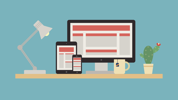
Responsive design resizes or reconfigures a web page to the screen of the device you’re using, whether it be a desktop, laptop, tablet, or phone. Why is this important? Take a look at the stats below:
- US adults spend an average of 34 hours per month browsing the internet on their smartphones, according to a recent Nielsen report.
- 51% of emails are now opened on mobile devises according to Litmus.
- 70% of mobile searches lead to an action on a website within one hour according to iAcquire. If the website isn’t mobile-friendly, 40% will choose another action.
Attempting to view a website or email on your mobile phone only to have to zoom in, and scroll side-to-side is the result of a non-responsive design. This leads to frustration and, as the statistics show above, a loss of leads or potential customers.
In this 2-minute video, we discuss responsive design and demo how responsive emails look from your VerticalResponse account.
Want more marketing tips and tactics? Sign up for our weekly email newsletter, The VerticalResponse Buzz.
© 2015 – 2018, Contributing Author. All rights reserved.


 Features
 Pricing
 Partner
 Blog
Blog Support
 More
More Terms of Services
 Privacy Policy