
Responsive Email Templates Are On the Way!
We’ve gotten lots of requests for responsive email templates lately, and we’re thrilled to share that your wishes are about to come true. Here’s a sneak peak into our new responsive templates!
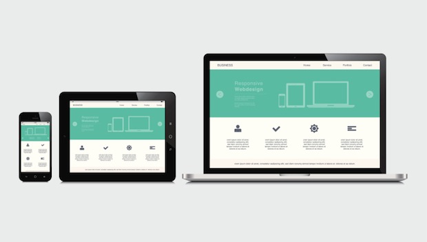
First, a quick definition of responsive design is that your website, email or blog adjusts to the size of the window viewing it. So your email will look slightly differently if it’s on a desktop, a tablet or a mobile phone.
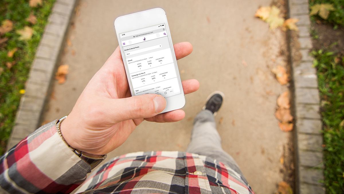
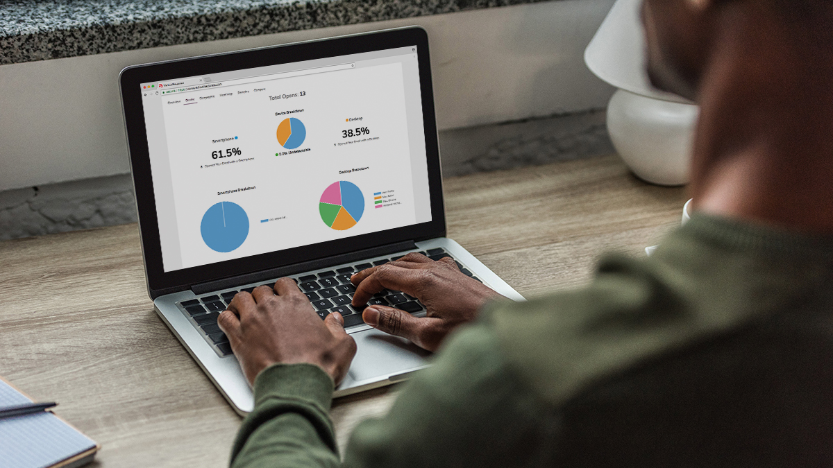
All of the templates in our updated system (to be released this Spring) are responsive, you can select any theme, use any images you like and your email will still adapt to the screen used to view it. Want to check out what your email is going to look like on a mobile phone? We’ve built in a preview page so you can see it before you push send; useful to know how things will look ahead of time and really, it’s kind of fun too.
To illustrate, I’ve created an email and will show you how it looks in the three different previews.
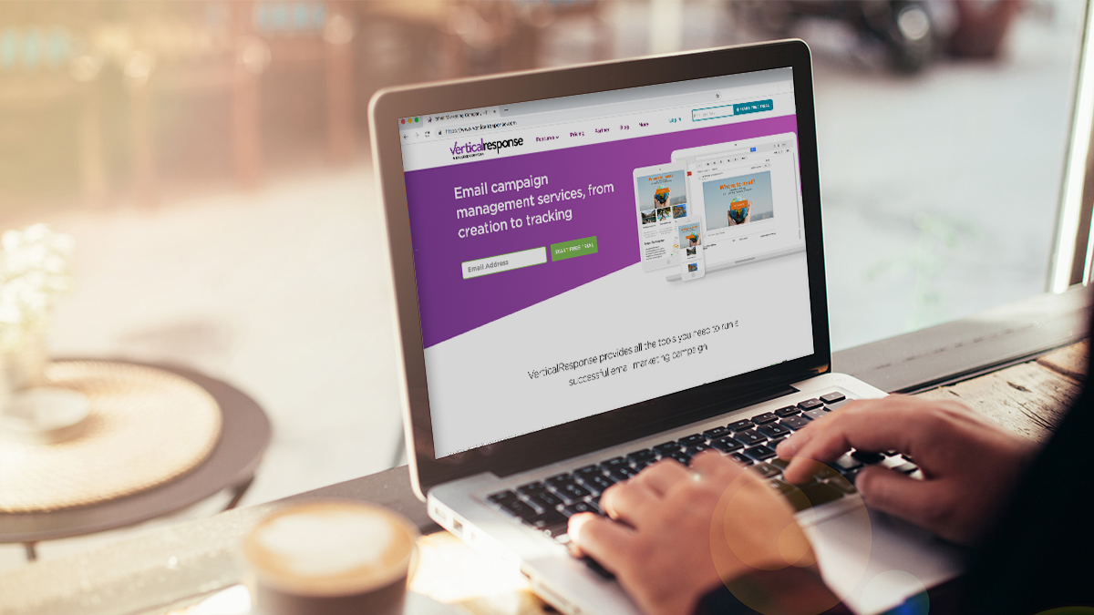
First up, and the default view, is on a desktop. This shows a good amount of the email and what it will probably look like for a lot of your readers. You can also scroll the preview image and see what the rest of the email looks like.
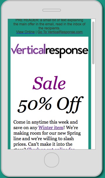
Next up is a mobile phone, you’ll notice the view changes quite a bit, and we put the text up front so that your mobile readers are drawn into the important part of your email first. The arrows show that you can flip the image, so you can see how it looks vertically or horizontally.
The last icon is for a tablet, and again you see both vertical and horizontal views, and what your readers will see. Since the screen is larger than that of a mobile phone you’ll see more of your email displayed here.
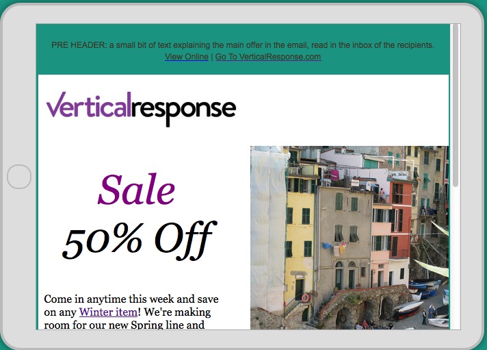
This brings up the point that you want the top of your email to have the most important info for your readers. This is what catches their eye first and draws them, and if they’re busy they can still see what you need them to see quickly. And don’t forget your logo, you can see in all these examples the VR logo is easy to see, you want your readers to know they have the right email, and who sent it to them.
If you want to see this in action, here’s a very short video showing the preview in action.
What do you think of responsive design? Let us know in the comments!
© 2014 – 2015, Contributing Author. All rights reserved.


 Features
 Pricing
 Partner
 Blog
Blog Support
 More
More Terms of Services
 Privacy Policy