
A New VerticalResponse is Coming to Town!
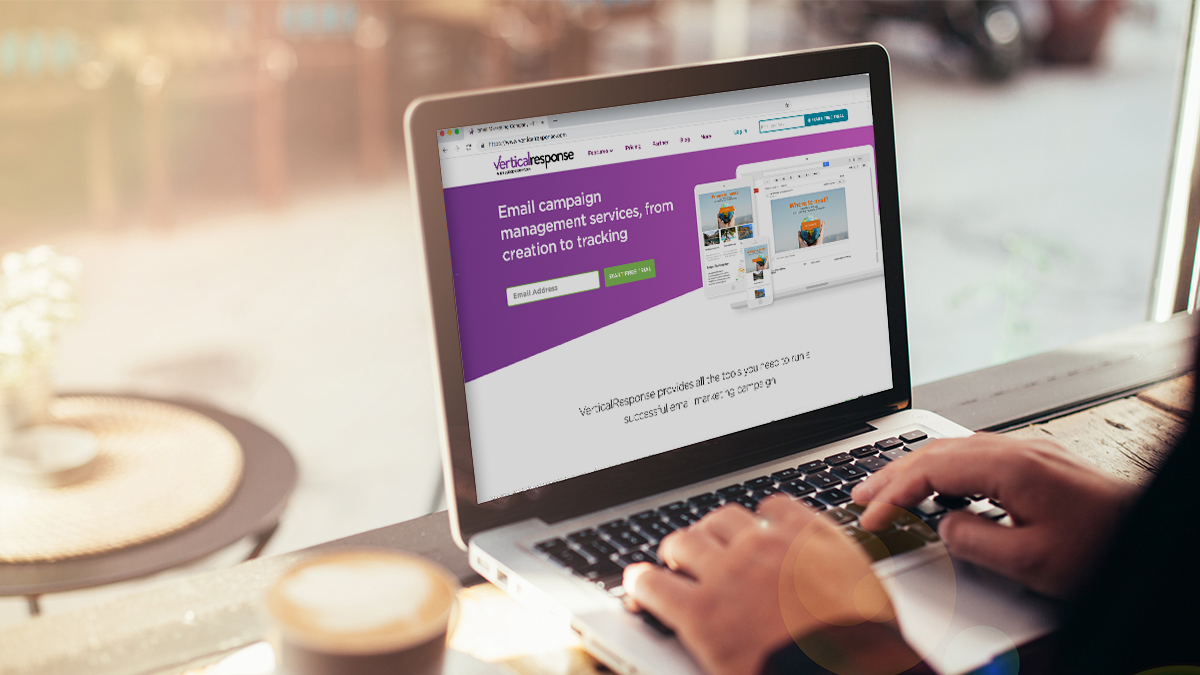
We’ve been hard at work on a brand-spanking new VerticalResponse! We’re pretty excited about it and think you will be too, so we’re giving you a sneak peek here on the VR Product Blog before we launch.
But first, we should let you know why we’re making such a big change. The simple answer is, marketing has changed a lot since VerticalResponse was born 12 years ago, before the days of Facebook, Twitter, and the iPhone. We want to make sure we remain the best self-service marketing tool to help your business grow, so we’re changing our product to help you take advantage of current trends.
There are three main trends that are happening in marketing:
- Nearly half of all emails are read on a phone or other mobile device
- Companies are using social media to connect with customers
- The integration of several marketing tasks into one tool
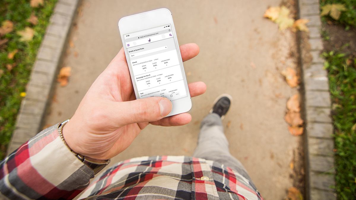
So, let’s take a closer look at mobile. We’ll cover social media and marketing integration in our posts over the next few weeks.
Check out these stats:
- 56% of American adults own a smartphone (Pew Internet, Smartphone Ownership 2013), which means they can read email, surf the internet, watch videos, and play games anywhere, anytime (Candy Crush addiction, anyone?)
- 45% of marketing emails are opened on a phone or other mobile device, like an iPad (Litmus, Aug. 2013)
- 32% of people read email ONLY on a mobile device (Harlan Clark Digital, 2013)
- 70% of people say they’ll just delete an email that doesn’t look good on a small screen. Only 9% will try to read the message on their smartphone. (Acxiom, 2013)
Even with the prevalence of mobile devices, 39% of marketers have no mobile plan (eConsultancy 2012 Email Marketing industry Census, as featured on the Salesforce blog). If you’re one of them, never fear. Here are a few quick tips:
- Optimize your email for readability on a variety of screen sizes, from a phone to a desktop monitor. If your recipient can’t easily read your message, it’ll quickly get sent to the trash.
- Make links, headlines and call to action buttons very easy to see/read, and don’t put them too close together – people’s fingers are bigger than you think!
- Remember to think about your landing pages. If a reader clicks a link in your email, is the page they’ll land on also optimized for small screen sizes?
Get more tips for designing mobile-friendly emails here. And, stay tuned to learn more about the exciting changes coming to VerticalResponse.
© 2013, Contributing Author. All rights reserved.


 Features
 Pricing
 Partner
 Blog
Blog Support
 More
More Terms of Services
 Privacy Policy
Hi Jason,
The initial release, which is coming soon, won’t include auto-responsders. But it’s something on the road map and we should have them a couple of months after the release. The new platform will make adding new or requested features much easier to add than our current one allows. If you’re waiting for auto-responders, your wait will be soon at an end!
Will this new version include any type of behavior based “automated” marketing tools, or at least some sort drip campaign ability?