

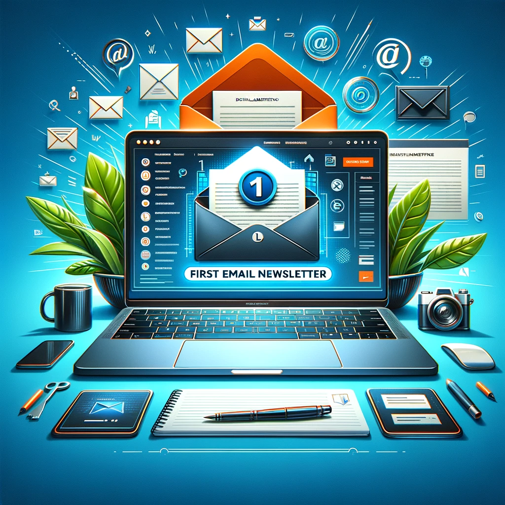
8 Design Tips to Make Your Email Newsletter Visually Appealing | graphic email newsletter
Email newsletters are a popular tool companies use to cultivate client connections and maintain brand awareness. Therefore, the design of your newsletter matters for conversions and user experience. It should be user-friendly for executing a responsive, skimmer-friendly design.
You may work smarter by “borrowing” from some of the most popular and successful newsletters’ designs. The layout suggestions for newsletters are simple and centered on creating a memorable user experience.
A layout for an email newsletter should include design concepts and components that allow it to function as a strategic marketing tool. Even if it has all the necessary components, an email newsletter layout might cause you to lose a subscriber who would have otherwise been a prospective customer and end up in the trash. email marketing tools
Making sure your newsletter design is aesthetically pleasing is essential since a well-done newsletter is a powerful email tool with many advantages. Readers are more inclined to click if it appears appealing.
You can produce content that will benefit your company if you put in a little effort and use the correct tools. However, you must be sure to present the appropriate material if you want your mailing campaign to be successful. This article looks at the components contributing to a newsletter design’s visual appeal and conversion efficiency email template email campaign.(create a newsletter
email subscribers short and sweet call to action cta)
8 design tips to make beautiful newsletters:
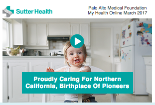
1. Header
Your newsletter needs a header. It is comparable to the name of a journal, newspaper, or website. It is located at the very top of your newsletter and should contain your business name, logo, and the newsletter’s title. Fortunately, online DIY tools like Stencil or Pixlr may assist you with your headers. With these apps, creating and saving graphics to your computer doesn’t need prior knowledge of graphic design. Simply build your header once, then use it again.
Here are a couple of examples:

2. Body and message
The central body of the page is constituted by a general container of 498px with automatic centering. This way, it aligns perfectly with the header and title.
The body is divided into three containers defined by the “message” class, dividing the central body into three columns.
These containers are 160px wide with a 3px margin. The total width would be:
(160px x 3) + (6px x 3) = 498px (this is why the width of 498px has been chosen).
Each of the “message” divs contains an image and a paragraph, which are placed following the flow of the document. These containers have float: left marked, which causes them to be placed next to each other.
The text of the paragraph has the characteristics that have been determined in the body, so it has not been necessary to set fonts and colors.
3. Footer
The footer is also framed in a div with 498px width. It has been placed in lighter font color since the function of this content is to provide the necessary information without excessive highlighting.
The link to the institution’s website has been marked to differentiate it from the rest of the paragraph. In the end, the links to the W3C validator have been placed so that they can verify that the documents are valid for CSS 2.1 and XHTML 1.1.
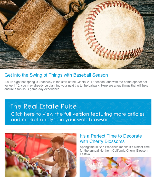
4. Subject and headings
Unlike other content marketing strategies, emails may include a block of text and still be read. But it doesn’t mean you can’t make an effort to improve readability in your email design. If you want to convey many tales in a single email, break them into separate parts with clear headers and subheadings, like in this straightforward business update email.
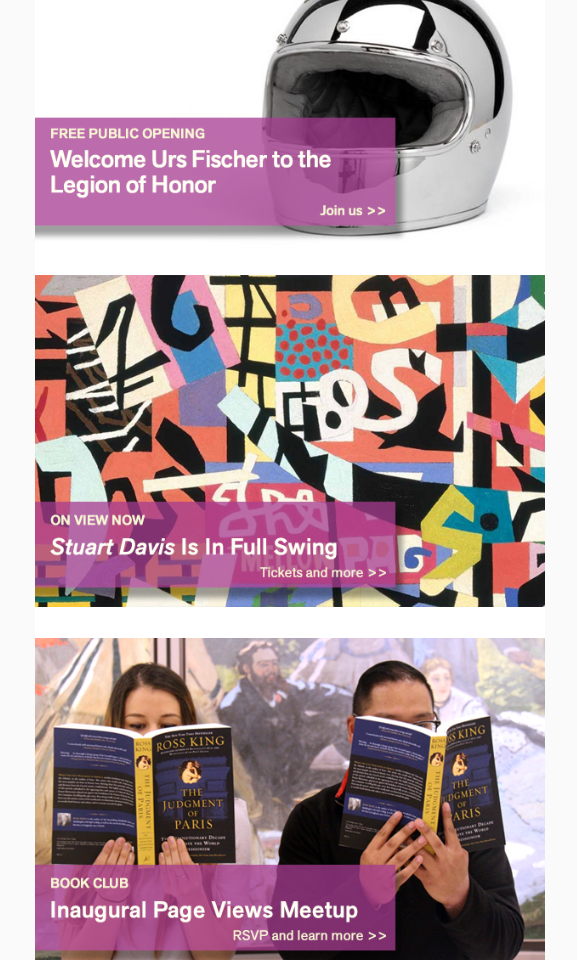
5. Stack content
If you’re using a newsletter template through an email service provider like VerticalResponse, you’ll be able to add content easily. For a layout that looks good to readers and scrolls smoothly on mobile devices, stack your content.
Here’s an example from the Fine Arts Museums of San Francisco:
6. Let your logo determine the color palette
Your newsletter requires a color scheme to be attractive. Don’t stray from the color scheme that your business has established. Use those hues as borders or text colors throughout your email newsletter. Use the colors in your logo if your firm doesn’t have a color scheme.
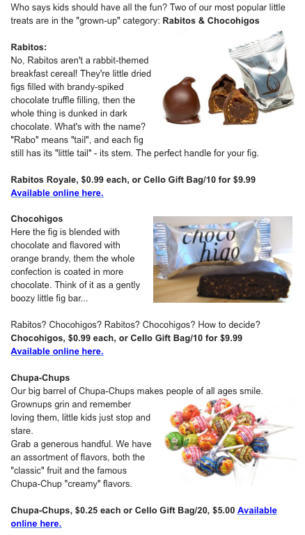
7. Use visuals
A well-made newsletter will contain a nice ratio of text to picture. Anyone who opens an email is attracted to the graphics right away. You can draw the reader in by using a few images while improving the content. However, not every company offers many “photo-worthy” chances to utilize their photographs. If you find yourself in this condition, employ simple visuals or think about including stock photos in your newsletter.
Here’s an example from San Francisco Bay Area-based The Spanish Table:
Of course, some businesses don’t have a lot of photo-worthy opportunities. For example, an online magazine that sells monthly subscriptions might not have much to take pictures of. If you’re in the same position, use simple graphics, or consider buying stock images from sites like iStock to incorporate into your newsletter.
8. Keep it basic so that your content can stand out
Any part of the newsletter that you don’t like may be removed, and it can be edited to fit the theme or message of your company. The font family, font size, paragraph spacing, and much more may change.
Add shapes and symbols to add further personalization. Create a strong color palette that naturally corresponds with your brand, applies smart color pops, and makes it recognizable.
Benefits of email newsletters
- It allows direct, fast, and cheap communication with the user.
- It is a very important source of web promotion.
- It helps to strengthen the bond between the employer and the client and increases the trust placed in him.
- It provides an opportunity to provide the reader with useful and interesting information, increasing interest in the publisher and their business.
- Help foster a sense of belonging to a group (users of your page) by creating a community among members.
Tips for making an effective email newsletter
- Write catchy email subjects – Deleting emails is the most common action in email management. People are bored of receiving spam messages and are not shy about deleting suspicious messages. To determine if a message is spam or not, the most frequent thing is to look at the subject. That is why it is important to write attractive titles and the least similar to an advertisement. Some keys:
- Be brief.
- Attract attention with action words.
- Be positive
- Appear believable.
- The headings “from” and “to”: it is preferable to customize these fields to show your name or that of your company. It is much better and closer than a simple email address.
- The way of writing: try to write short paragraphs with close language, it is not a matter of becoming a showman, but emails do not usually carry the formality of other types of business communications. Try to expose the central theme in the first paragraph to place the reader from the beginning and write correctly and without mistakes.
- HTML or text: we refer to sending emails in HTML format or text only. In HTML, you have more options to present your mail, adding colors, images, etc. A few years ago, few mail servers supported the HTML format, but today it is much more widespread, so I think it can be used without problems most of the time.
- The signature of the mail: do not forget to put at the end of each electronic newsletter that you send your signature, which includes at least the name of the company and the URL of the company.
Conclusion:
In general, you want an eye-catching email newsletter. It should be written in a clear, orderly manner that makes it simple for the reader to take in all the information. With these suggestions, you can freshen up your newsletter, make it easier to read, and produce an email newsletter that your readers will like receiving.
When you’re creating your next email newsletter, remember that you want it to grab your readers’ attention. A clean, organized layout that makes it easy for the reader to digest your content is the best way to do that. Use these eight tips to spruce up your design, increase readability and create an email newsletter that your audience looks forward to receiving.
Visually appealing emails are crucial in ensuring that your email marketing campaigns are effective and successful. A well-designed email can help increase open rates and engage your audience. The key to creating visually appealing emails is to pay attention to the design elements and ensure that the email is well-organized and easy to read. This includes using a subject line that is eye-catching and relevant, incorporating white space to break up blocks of text, and including a clear call to action that directs the recipient to take a specific action.
Additionally, it is important to consider the email client that your audience is most likely to use. For example, some email clients may not display images by default, so it’s important to ensure that the email still looks good and is easily readable even without images. Utilizing a pre-made email newsletter template can also make it easier for you to create visually appealing emails with minimal effort.
Ultimately, visually appealing emails should be simple, yet effective, and deliver pieces of content that are relevant to your target audience. By following these tips, you can create visually appealing emails that will help you achieve your marketing goals and improve your overall email marketing strategy.
Join 140,000 small business owners
Editor’s note: This blog post was originally published in January 2015 and has been revamped and updated for accuracy and relevance.
© 2017 – 2018, Contributing Author. All rights reserved.


 Features
 Pricing
 Partner
 Blog
Blog Support
 More
More Terms of Services
 Privacy Policy
What are the side effects of cheap cialis online, generic for cialis .
Hi Tom,
Thanks for reading. Which version of VerticalResponse are you using – Classic, or our latest product? We have a variety of similar formats like the Behance example (that example actually does have full width boxes below – This is a cropped version) in our newest version of VerticalResponse. You can easily add or remove sections to these templates to make them look the way you’d like. All of our templates in the newest version of VerticalResponse are also 100% responsive, which you may not from other companies like Constant Contact. Our support team is also always glad to help, so don’t hesitate to give us a call: https://www.verticalresponse.com/support
Let us know what we can do to help!
Cheers,
Colleen
VerticalResponse
Hi Lisa,
Nice article. I don’t see a template that would give me a format like Behance. I like that but then I need full width article boxes to follow below. It is a newsletter.
I can get the format that I want with Constant Contact but I don’t see the same design flexibility with VerticalResponse.
Tom
Do not take a double dose to make up for a missed one, buy cheap viagra online.