
A Surprising Marketing Test & The Results
As email marketers, we’re constantly trying and testing new things to optimize our copy, creative and results. Our Director of Lifecycle Marketing, Kim Stiglitz, recently tried a few tactics with an email we send each month to customers that have signed up for our free trial, but haven’t activated their account (double opt-in). I wanted to share the results with you because I thought they were pretty interesting and a bit surprising.
The Details
Kim got a list together of all VR customers who have signed up for a free trial, but never activated their online account (we require customers to double opt-in, so this is a necessary step). Kim sent one creative (Version A) in April and one creative in May (Version B). She could’ve also run a split test which the team often does.
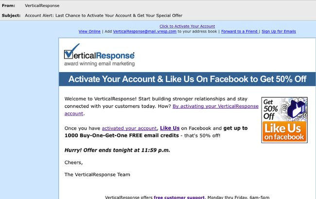
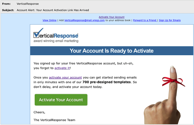
Version A encouraged customers to activate their account, and then offered a discount if they “liked” us on Facebook. Version B didn’t offer an incentive and focused solely on encouraging customers to activate their account.
Version A
Version B
The main differences are:
1. The subject line
2. Discount vs. no discount
3. Copy & images
4. Call-to-action buttonBased on what you see, which version do you think performed better? What metrics would you base that on? We looked at three things: the open rate, click through, and of course, how many people on the list actually activated their account.
And the Results…Version B received 32% more opens and clicks. The subject line in Version B compelled more people to open it and the lion’s share of the clicks came from the bow around the finger image, the “activate your account” links in the first three lines of the email, and the call-to-action button. What kind of creative and copy testing are you doing? Try shaking things up from time to time and you may be surprised by the results.
© 2011 – 2012, Contributing Author. All rights reserved.


 Features
 Pricing
 Partner
 Blog
Blog Support
 More
More Terms of Services
 Privacy Policy
Version B had 20% more activations and interestingly enough, the largest % of activations came from accounts that were over a year old!
I’d actually expect this result as far as the performance of the campaign itself…Version A is more of a marketing context, where Version B is more customer service (to which I’d expect better response).
You didn’t tell us whether one version or another generated more actual activations. That would be interesting, especially where the special offer was concerned.
The fact that the finger/bow graphic got the most click-throughs is unexpected; we’ve found in-line links to get the best results for our campaigns, but it would be worth testing more creative graphics.
Thanks for sharing!
Hi Janine –
thank you, great info! I conjecture that part of the reason that B had better results is the simplicity of the message – you only asked the reader to do one thing. It would not work as well if the reader did not know the company and it’s capabilities.
On another note, I think of blogs as really personal – yet I had to click twice to learn your name.
Thanks again! Lisa