

Does Your Business Need a Responsive Website Design?
If your business has a website, you’ve probably been hearing a lot about responsive design lately. After all, Mashery has called 2013 the Year of Responsive Web Design. But, what exactly is responsive design and how can it make your website better?
In a totally non-techy nutshell, responsive design means that elements on the page will be resized or the layout reconfigured so that your content looks good and is easy to read no matter what screen size it’s displayed on, whether its a desktop, laptop, tablet, or phone.
The news satire site The Onion is a good example. Here’s what happens as I make my browser window narrower to simulate smaller screens.
The original layout is three columns, then changes to two columns, then finally one column.


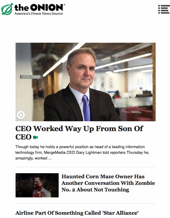
You can see that as I made my browser window narrower, the content automatically rearranged itself from three columns, to two columns and then one column. This ensures that it’s easy to read and navigate whether I’m reading on a big desktop screen or a small phone screen.
How does this magic happen? There are three main principles:
- Fluid grids. The different elements on a webpage are laid out on a grid and sized based on relative units like percentages, rather than absolute units, like number of pixels.
- Flexible images. Images are also sized relatively, to keep them from “barging in” on other parts of the grid on a different screen size.
- Media queries. This is just a fancy way of saying that your site can detect the device that it’s being displayed on, and automatically adjust its size and layout accordingly.
So is responsive design just the latest fad, or something you really need consider? According to Pew Internet, 63% of adult mobile phone owners use their phone to go online, and 34% of those who go online with their phone do so mostly from their phone, and don’t use a desktop or laptop computer for internet access. And research firm IDC estimates that more people will access the internet through a mobile device than a PC.
Take a look at this chart, also from IDC.

They’ve forecasted the market share of internet-connected devices with different screen sizes. The smaller the screen size, the larger the expected increase in prevalence over the next few years. So, yes, you definitely need to think about how your site looks on a variety of screen sizes. When you build your site using responsive design, there’s no need to create different versions for all the potential screens out there. Like a fish in a bowl, the content will grow only as large as the space allows.
Obviously, there’s a lot more to creating a responsive website. If you’d like more information, check out Responsive Web Design by Ethan Marcotte, who is considered to be the “father” of responsive design.
If you do decide to implement responsive design, unless you’re a web-coding guru, you will need to hire someone to help. Responsive design is still relatively new, so when hiring a web designer, make sure they can not only explain responsive design and how it would benefit your particular site, but also show you examples of responsive sites they’ve created.
Are you considering a responsive design for your site? Check out Deluxe Website Design Services. Share in the comments!
© 2013 – 2018, Contributing Author. All rights reserved.


 Features
 Pricing
 Partner
 Blog
Blog Support
 More
More Terms of Services
 Privacy Policy
Based on the evidence you supplied concerning mobile web browsing, responsive design seems to be an important thing to consider for business websites. If it’s hard to follow a design on a phone, viewers may give up entirely on the site. I think it’s important to accommodate the method that most (or even all) viewers are using to view your website. https://evolveitnow.com/our-work.html
You stated that according to Pew Internet, 63% of adult mobile phone owners use their phone to go online, and 34% of those who go online with their phone do so mostly from their phone, and don’t use a desktop or laptop computer for internet access. Do most companies have websites that are phone or tablet friendly? I can imagine that in this day and age having a good website might be very valuable. Hiring a website design company might be a beneficial option. https://webhorsemarketing.com/services/website-design/
Nice post about website designing. It is really important to design a website in such way that users will find it interesting. Formatting of text, images and menu bar for navigation should be visually appealing to users. Nowadays users are accessing the internet using different devices, so device compatibility and browser compatibility should be there.
Jennifer, Great job on this article. It explains what responsive website design is, without the technical jargon. It’s also great that you provided stats so that we get a grasp of just how important it is to have responsive web design these days.
There are many good reasons why you should use responsive design for your business. In order to improve the online presence of your business, responsive web design is the key.
With a variety of different products in the market that provide various ways to view your website, responsive web design is becoming more and more important. This provides maximum benefits for the viewer regardless of the device they are using