

Create CTAs readers can’t resist
Editor’s note: For this blog post, we asked Reid Yoshimoto, one of our email marketing experts, to weigh in on the best way to create compelling call to action (CTA) buttons for your email campaigns. Here’s what he had to say:
As a marketer, I’m always looking for ways to get our customers more engaged. As a result, I’m always testing. I test subject lines to see what increases open rates, I test email templates to discover what increases click-through rates, and I test call to action buttons to see what gets people to click on them.
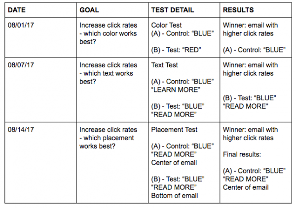
Testing your CTAs isn’t difficult. Just put some thought into it first. What is it you want to test? What results do you want to see, and what do you want to do with the data? I’ve always put together a simple test matrix for any sort of A/B testing that I do, so it’s easy for me to track what I tested and what the result was. You can put together a quick and easy test matrix with a spreadsheet, naming your columns Date, Goal, Test Detail and Results. And remember, with any test, it’s important to change only one element at a time and keep everything else constant, so you don’t skew your results. Here’s a test matrix I used recently:
If you plan on running a CTA test, here are three simple variables to try:
1. Color
Blue or red? Green or yellow? Something else? I’ve used a variety of colors with emails campaigns we’ve created for our subscribers. Both red and blue have been effective in our campaigns. Pick colors that make the CTA the dominant element of the email, which will grab the reader’s attention. Text color is equally important — darker backgrounds require lighter text to make them stand out, and vice versa.

2. Text
Take a look at the content of your email. Is it a promotion? Lines such as BUY NOW or SAVE TODAY or even ADD TO CART encourage a customer to complete an order or take advantage of your offer. Is the email about educating your customer? Text such as LEARN MORE or READ MORE invites them to get information about your product in one easy click. Here are some text variations that we’ve tested:

3. Placement
Top or bottom? How many buttons should you put? Test, test and test again. Place a button at the bottom of one email, and place another button at the center of a different email. Remember your readers use a variety of devices to view your emails, so the seemingly obvious placement may not always be your winner. If you have two buttons in any given email, then try using color as your variable: one email with blue buttons, for instance, and one email with red buttons. Keep your test simple and, again, be sure to only test one variable each time. If you have too many variables in one test, then your results won’t be conclusive.
Set goals and ask yourself what you want to learn from conducting a CTA button test. Color can dominate an email, text makes an action clear and placement gives you a sense of where your customers’ eyes are. All the results you reap give you additional insights into your contact list and tell you how to ultimately encourage your customers to take action. Start testing today.
Join 140,000 small business owners
© 2017 – 2019, VerticalResponse. All rights reserved.


 Features
 Pricing
 Partner
 Blog
Blog Support
 More
More Terms of Services
 Privacy Policy