

3 ways the iPhone 6 affects your emails and what to do about it
New records were set with the recent September 19 release of the new iPhone 6. Apple recently announced that in the first three days, it sold over 10 million new iPhone 6 and iPhone 6 plus models, more than any other release. By the end of the year, the new phone will be available in 115 countries, and millions more will be sold.
Apple states the new iPhone 6 and iPhone 6 plus “are the biggest advancements in iPhone history” with one of the most notable advancements being an increase in screen size. The iPhone 6 dons a 4.7-inch display and the iPhone 6 Plus comes with a whopping 5.5-inch screen. The iPhone 5 now seems small in comparison with its 4-inch display, and the iPhone 4 trailing behind with a 3.5-inch screen. But what do these changes have to do with your email campaigns?
With bigger screens and millions of new iPhone 6 users, comes bigger opportunities and reasons to adjust and maximize your emails. After all, 65% of email is now being accessed via mobile devices in the U.S. according to VentureBeat reporting data from the Q4 2013 US Consumer Device Preference Report. Mobile-friendly emails (especially up-to-date ones) are a must, so with that, here are three ways in which the new iPhone 6 affects your emails, and what to do about it:
1. More Pre-Header/Preview Space
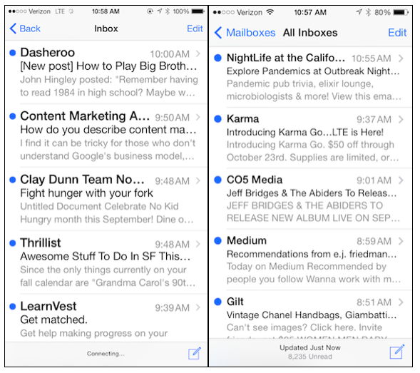
The larger screen sizes leave room for additional pre-header text to display in the inbox. The iPhone 5 currently displays around 11 characters/words (give or take) of pre-header text in the preview. The iPhone 6, however, displays 13+ characters and/or words or more. More real-estate gives you more of an opportunity to entice readers to open your email.
Note: People can adjust their settings to display additional pre-header/preview text (up to 5 lines), but for majority of those who use default settings, this is what they’ll see:
Now is the time to take your pre-header seriously. Long gone are the days in which the first line of your email reads, “Can’t read this message? Click here.” Treat your pre-header as secondary subject line and include even more info about the value readers will get inside the email.
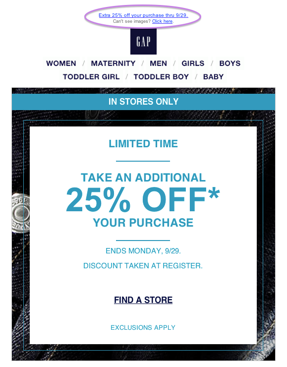
Not sure where to put the pre-header in your email? Above everything else! The pre-header should be well thought-out, enticing and placed above images including your masthead or logo. In this Gap email, you’ll see the pre-header at the top of the email design, even before the logo, which translates nicely in the inbox:
Tip: If you do place an image at the very top of your email above everything else (which we do occasionally in our newsletter), Gmail commonly pulls the alt-text from your image into the pre-header. This brings up two very important points:
- You should always add clear, brief and enticing alt-text to your images.
- If you insist on placing an image in your email before the pre-header, you can remove the image’s alt-text (if it isn’t relevant) to avoid pulling it into the pre-header. However, if your first image is large, it doesn’t display in your reader’s email reader for whatever reason, and there isn’t any alt-text, there won’t be any context for that image, which can translate to a bad user experience. At the very least, add a pre-header immediately after your first image.
2. More Content Above the “Fold”
According to Tony Haile at Chartbeat, 55% of people spend fewer than 15 seconds reading a page online. Hence, you want readers to find your most important information as quickly as possible. Luckily, the new and larger iPhone 6 screens display even more of your email above the “fold” or cut off point on a phone.
While this works in everyone’s favor, now is the time to reassess your design and maximize valuable space. Trim up your mastheads, banner ads and/or logos at the top and move your most enticing information, events, promo codes, and call-to-actions higher.
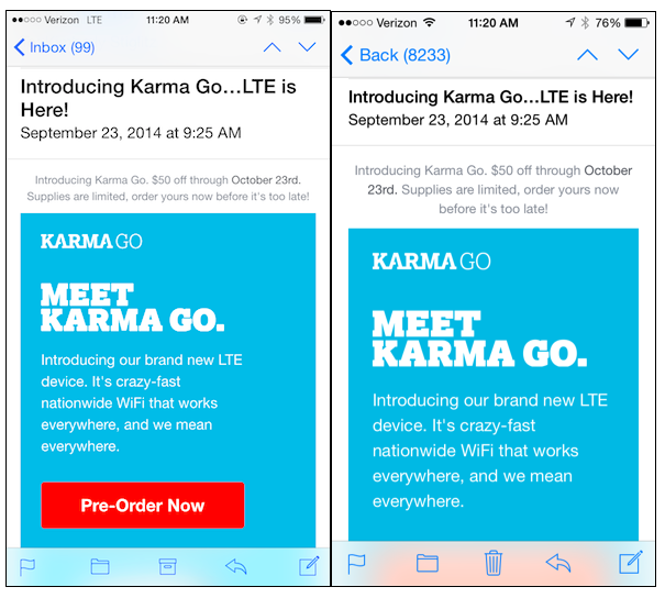
In the example below, the red “Pre-order Now” call-to-action button in the email on the left (iPhone 6) appears, where as the button is pushed below the fold in the iPhone 5 on the right. You’ll also see, however, the text in the body of an email on an iPhone 6 appears smaller to accommodate for more email display. This means, you should increase the size of your email font, especially if you’re using anything under 12 or 14 pt.
Note: People can adjust their settings to increase the font size of subject lines and pre-headers, (which may affect how much of your email is displayed), but the text within the body of the email will still appear smaller as seen here:
3. Necessary Mobile-Friendly Design Changes
If you’re already using a responsive email design (one that adjusts to the screen size your reader is using), well done. If you’re an email designer, you will need to account for the screen size height and width changes when creating a responsive design. Our friends at Litmus wrote an extensive piece about these technical changes stating that “adjustments to media queries and breakpoints for responsive or adaptive emails will be necessary.” Find those necessary changes, and useful information here.
How will you be adjusting your emails for the new iPhone 6? Tell us in the comments.
Get more marketing and small business tips by subscribing to the VR Buzz weekly newsletter.
© 2014 – 2018, Contributing Author. All rights reserved.


 Features
 Pricing
 Partner
 Blog
Blog Support
 More
More Terms of Services
 Privacy Policy
On my iPhone 6+, when I try to open mail, I get a blank white screen, then it immediately returns to app screen.
Can anyone help?
Thanks
Shifting over to accommodate the newer, bigger display of the iPhone 6 leaves all our customers behind who do not have iPhones, or do not have the latest iPhone. That feels exclusionary to me.
Just my two cents.
Hi John!
Thanks for reading. Regarding the 13 characters – It’s 13+ characters and/or words. Take a look at the second pre-header down on the iPhone 6 inbox example. You’ll see there are 14 words listed ex: “I find it can be tricky for those who don’t understand Google’s business model…” Hope that helps. Let me know if you have more questions!
Cheers,
Colleen
VerticalResponse
Thanks for this article, as accommodating the iPhone is paramount.
But I am unclear on “13+ characters or more”. Can you please show a screen shot circling where the preheader is displayed, with 13+ characters?
Hi Ray!
Thanks for reading. All of the email templates in our newest version of VerticalResponse are responsive. We’re still furiously adding features (that currently exist in classic) to this newest version, so we haven’t quite migrated people using the classic version over yet, but you can certainly create an account and check it out! You do have to use a different email address other than the one you use to log into classic. You can sign up here: https://vr2.verticalresponse.com/users/sign_up?utm_source=&utm_medium=organic&utm_campaign=blog&utm_term=/blog/&utm_content=&sn= Let me know if you have any questions!
Cheers,
Colleen
VerticalResponse
This is great information, but when will YOU be offering Responsive Design templates like MailChimp now does?
Great call with the compelling alt text and CTA placement Colleen. Love using Litmus to test these out.