
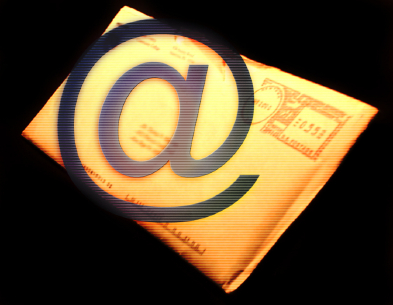
Everybody’s Doing it, But Are Image Heavy Emails Really a Do?
If you take a look at your inbox these days, you’re bound to see a lot of emails that contain either very little text and one big image, or lots of images. We live in a visual world and an image can communicate a lot. This may make you think creating an email from one big image, or a lot of them, is the best way to go. The pros here at VR always say image heavy emails are not the best way to go, and we’ve created blogs, webinars and guides explaining why. But instead of just saying “Don’t!”, we thought we’d go through the benefits and drawbacks of creating image heavy emails.
Before we get into that, let’s think a bit about how emails are handled by the reader. Most email programs (like Gmail) block images, by default, until the reader enables them. According to a study by The Relevancy Group, 55% percent of the people polled enabled images in the emails they get. Pretty good news, although it does mean that 45% of your readers won’t see images. Ouch! This same study also found that only 16% added an email address to their address book, which for some email programs help render images automatically. Okay, so now that we know more than half of readers will turn on the images in an email, lets take a look at what’s good, or possibly bad, about creating emails with lots of images.
Benefits
Visually Appealing– The first, and probably best, reason for creating an email with lots of images is that it looks good. Most likely, your recipients will respond to an interesting and compelling image. And that’s what email marketing is all about, getting your readers to respond to, and engage with what you’re sending to them. By using lots of images in your email you can also create the look you want for your email, without having to code for different systems or email programs. If they can render an image, your email should look good. And if you have a designer, or can create something yourself, you can be as creative as you like.
Tip: Try slicing up your image if you have just one, smaller images will load a bit quicker, and you’ll have more opportunity for Alt Text.
Control – How many times have you wanted to create an email using a specific font only to have it not work in certain email programs? Frustrating! But if you use text in your images, you can have any font you like. It makes it much easier to match corporate fonts, logos or just to marry the look and feel of your website. Take a look at the image below and check out some of the fun, visual things The Container Store did with their images.

Disadvantages
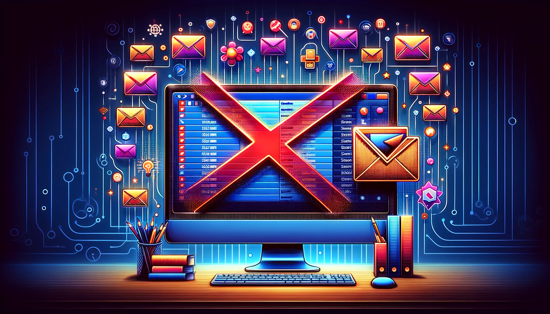
Delivery – This is a big deal, and something that can fill an entire blog post. Suffice it to say that image heavy emails can wind up in the spam folder, the last place you want your email. ISPs look for, and at content to help decide where your email will be delivered. If there is no content (images don’t really count) your email may go to the spam folder. Even worse, most ISP spam filters are looking at content engagement these days, so if your recipient doesn’t turn on images and has no links to click, your email may never get to them. And, an image heavy email is one of those tricks spammers like to use, so your email could be flagged as spam.
Tip: Be sure your HTML is clean (all tags nested and closed) and that your links go to good pages. With an image heavy email everything else has to be on the up and up to get in the inbox.
Reporting – Since an image heavy email won’t have much text, there will be little reporting since you won’t be able track certain links or words or even find the heavily trafficked parts of the email. You can link an image, and you should, but if there is only one image, you’ll have only one link to track. One way to work around this issue is image maps, linking parts of an image to different URLs, but this doesn’t work well in a lot of email programs, so you’ll still have limited tracking.
Looks Bad – So the opposite of the first benefit point is also true, without images turned on your email can look pretty sad. In fact, it probably looks pretty bad if you just have images in the email. And that won’t be very engaging to your recipients. Here’s where your Alt text is really important. You need it to be interesting and compelling enough to get your readers to enable images, and to tell them what the purpose of the email is.
Slow Loading – With an image heavy email your readers may find it takes longer for your email to load, and may give up waiting. Not everyone has fast internet connections, so you may lose recipients if they can’t see the email. Also, mobile phones are very popular for reading emails, and WiFi can be slow on those devices. Mobile use is just going to keep rising and if your email frustrates them they won’t read it, or may even unsubscribe.
The rules of using images apply no matter how you are creating your email, not too many or too big, make them interesting, use alt text and always link. By using a balance of text and images, you should get better engagement, stats and ultimately, you could see a boost in your business.
What are you plans for using images in emails?
© 2013 – 2018, Contributing Author. All rights reserved.


 Features
 Pricing
 Partner
 Blog
Blog Support
 More
More Terms of Services
 Privacy Policy
[…] images are not a tool for communicating critical information. Researchers estimate that only 40-45% of individuals who open your emails will unblock your images. Overloading your emails with excessive pictures […]