

Email Design Guide | Email design do’s and don’ts
Email marketing is an ideal and affordable marketing strategy for small businesses that want to quickly build a customer base and yield profits with minimal investment. But before you can get people to click on your messages, you have to capture their attention. Design plays a critical role in marketing success, so keep the following email design do’s and don’ts in mind when you develop your email campaigns.
Email layout design tips
From header to footer, your email layout should naturally funnel readers’ eyes through benefits that create desire and toward strong calls to action (CTAs) that motivate response.
Do’s
- Balance content and feature more text than images — at least 60 percent text to 40 percent images.
- Incorporate plenty of white space for a clean look that visually separates design elements.
- Prioritize content hierarchy, with the most important content, featured first — above the fold.
- Use a responsive template optimized for desktop and mobile devices (50 percent of emails are opened on mobile).
- Make your content easy to scan, so recipients do not need to read every word to understand your email and click your CTA.
- Use headings and subheads to maintain visual organization.
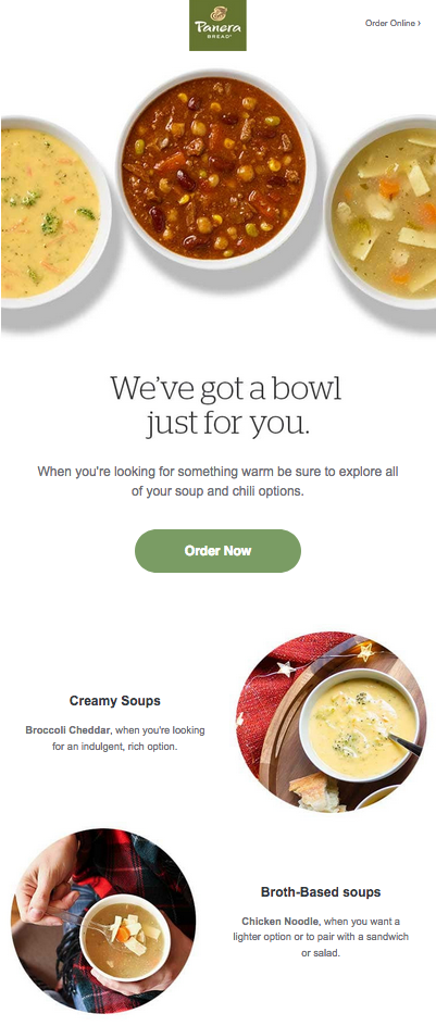
The example below from Panera Bread has plenty of white space, expertly mixes images and text, and uses subheads to divide up sections. All of these elements work together to produce a scannable and visually appealing email.
Don’ts
- Don’t use a single image for your emails; many email clients will not automatically display images.
- Don’t feature a long block of text anywhere in your email. Instead, break content into concise sections.
- Don’t make your emails too long. Some email clients clip long messages (Gmail, for example, clips any messages larger than 102 KB). Clipped messages are not only bad for marketing and forwarding, but they can violate CAN-SPAM rules because they hide unsubscribe links.
- Don’t stuff everything you can think of into your emails; instead, use emails as tools to motivate clicks for more information and purchases.
- Don’t use a dark, patterned or image background for your content (it’s OK to have a dark background behind a lighter main body content area, which can make your email pop, though it won’t show in all email clients).
- Don’t make your layout too busy — keep your emails simple with easy-to-digest summaries and clear calls to action.
Email color tips
Your choice of email color can help your brand and message stand out. While it’s fun to experiment with colors, your choices should be strategic.
Do’s
- Limit the number of colors you use (you can match your brand and website colors or choose colors specific to your current promotion).
- Contrast dark text against a light background.
- If desired, fill headers and footers with your primary color, or use colored lines to separate them from the main body content.
- Use images to add additional colors to your email design.
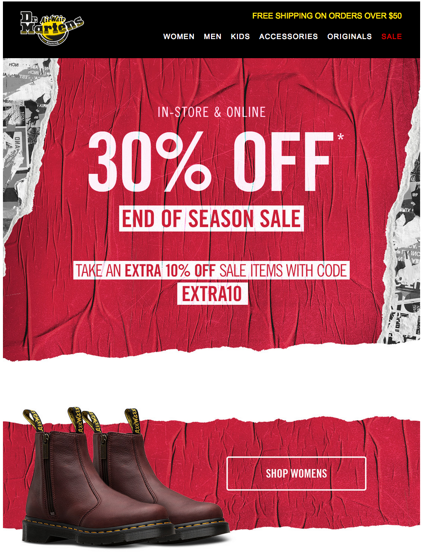
The red and yellow in the Dr. Martens email below add a nice pop of color email design guide and complement the design’s black and white elements. The limited color palette draws the reader’s attention to the copy, while a busier design might have pulled focus from the most important information.
Don’ts
- Don’t use colored body text – keep it black or dark gray.
- Don’t use a dark-colored background for your main content area.
- Don’t use more than two colors in your design (multi-colored logos and images are fine).
- Don’t use colors that clash or are otherwise unattractive.
Email fonts and typography tips
Keep typography simple for legible emails that engage readers.
Do’s
- Use only one or two fonts in your email.
- Use sans serif fonts for body text; either sans serif or serif fonts may be used for headers and subheads.
- Use simple, easy-to-read, web-safe fonts. Examples include Open Sans, Helvetica, Courier, Raleway, Droid Serif, Arial, Tahoma, Times New Roman, Georgia and Trebuchet MS.
- Size body copy fonts at 14- to 16-point, headline fonts at 22- to 24-point for best readability.
- Use fonts that align with your branding and messaging.
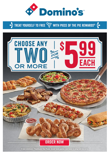
Domino’s has some fun with the fonts they use in this email. But even their more stylized text is easy to read.
Don’ts
- Use script fonts or other fancy fonts, which can be difficult to read.
- Use custom fonts that may not render correctly on all devices.
- Use colored fonts, except for headers (dark gray or black work best for body copy).
Email emojis tips
Emoji use by brands has risen 609 percent year-over-year in digital communications. Here’s how to use them properly.
Do’s
- Incorporate emojis to save space, yet say more in email subjects (keep your subjects under the “magic” 49-character threshold).
- Use emojis to make email subjects stand out in recipients’ inboxes.
- Only use relevant emojis that help convey your message and create excitement.
- Add personality with emojis in salutations and signatures.
- Use emojis to highlight deals and special offers in the body text.
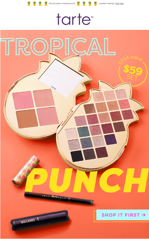
The subject line above from Tarte Cosmetics, featuring two pineapple emojis, was the perfect lead-in to an email about their new pineapple-shaped makeup palette:
Don’ts
- Don’t overuse emojis – they should serve as meaningful accents, not the bulk of your message.
- Don’t use confusing emojis. Stick to emojis that are universally recognized: smiley faces, coffee mugs, etc.
- Don’t rely exclusively on emojis to make key points. They may not render correctly in all email clients, so they should be used to reinforce your message.
Email image tips
Images are worth a thousand words, but within emails, they should be used in moderation.
Do’s
- Save images at 72ppi/dpi and optimize for the web for quick-loading emails.
- Use JPG and PNG images in emails. Use GIFs sparingly and only if they aren’t too large.
- Stagger images and text for a clean, easy-to-follow layout.
- Use compelling images that create desire and tell your story: your products in use, for example, or happy customers.
- Use image alt text so readers can read what your images are about if their email clients do not display them. Good alt text will still motivate clicks.
- Size images for retina displays (twice the size of normal displays).
The email below from Whosits & Whatsits uses high-quality images to promote its new line of hats. The models are shown in action, which brings the photos to life.
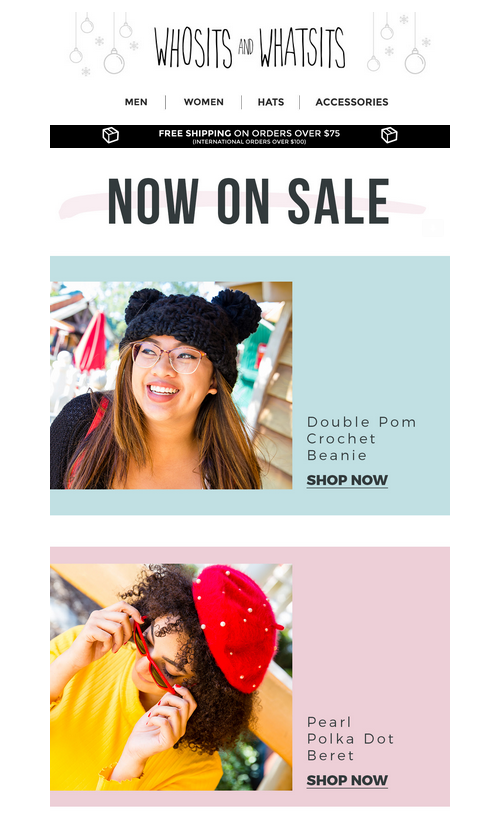
This email from Whosits & Whatsits uses high-quality images to promote its new line of hats. The models are shown in action, which brings the photos to life.
Don’ts
- Don’t use images as your entire email, since they may not automatically display in many email clients.
- Don’t use images for call to action buttons, since they may not render.
- Don’t rely on images to tell your story; it will be lost by email clients that do not automatically render images.
- Don’t use complex or confusing images that risk alienating customers.
- Don’t increase image size for emails — always size down for crisp, captivating email images.
Email call to action (CTA) tips
Your CTA fuels email success. Make sure it’s effective with these tips.
Do’s
- Make your call to action a color button that stands out from the rest of your email content.
- Keep your CTA text short and meaningful: buy now, learn more, read more, etc. Check out this list of 50 calls to action that sell for more ideas.
- Place your first CTA above the fold, and repeat it below if necessary (two or three CTAs per email is a good rule of thumb).
- Make your buttons large enough that readers don’t miss them.
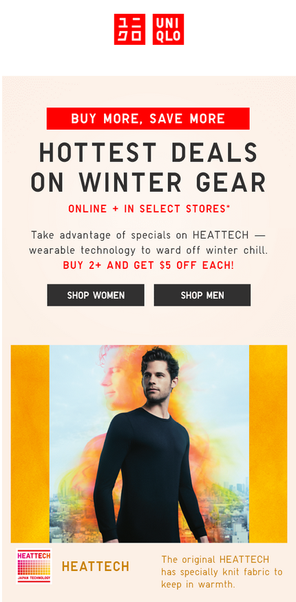
Uniqlo’s dark gray call to action buttons are above the fold and stand out against the email’s light background:
Don’ts
- Don’t overload your email with different calls to action. Instead, focus on driving readers toward a single action. If you have more, send more than one email.
- Don’t bury your call to action. You want your CTA to stand out, get noticed, and get clicked.
- Don’t deviate from your subject. Your CTA should align with your subject, so readers know what to expect when they open your email and to comply with CAN-SPAM regulations (no trickery!).
Email header and footer tips
Achieve a professional look with these tips for designing email headers and footers.
Do’s
- Incorporate your logo or company name into your header to identify your brand.
- Add teaser text before your header, which will appear on the subject line in many email clients and give you another opportunity to influence opens.
- Apply the same header and footer across all campaigns for consistent branding.
- Include contact information, additional resources such as social media links and value-added links, unsubscribe links, and any legal fine print in the footer.
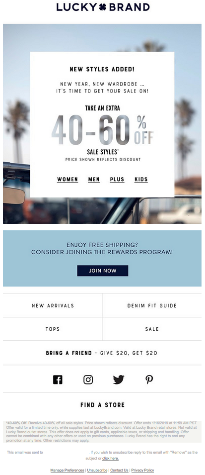
In the promotional email below, the Lucky Brand logo is the first thing you see when you open it. The clothing retailer also includes social media links in its email footers.
Don’ts
- Don’t create a complex design for your header or footer — keep it simple so readers can get to the meat of your email.
- Don’t add a lot of navigation to your header or footer. Simplify as much as possible, so you can effectively brand your emails without getting in the way of your message.
- Don’t include too much text in your header or footer — again; simplicity is key.
Whenever you’re tinkering with email design, remember that it’s best practice to make sure new design elements look right across every platform and browser; fortunately, VerticalResponse’s Test Kit makes that part easy. And, armed with these tips, you can design compelling emails that get opened, motivate clicks, and fuel sales.
Bonus Tips for Email Templates Design
Email marketing expands your brand’s reach, enabling you to create a strong brand identity for your product. responsive design email design best practices good email design. Therefore, it is crucial, particularly for small company owners, to ensure that the email is crafted to motivate the recipients to take the necessary action.
However, most marketers commit a fundamental error by failing to design email templates suitable for the average user’s inbox. Sending written, designed, or structured emails lowers your reputation, and people pay less attention when they get a disorganized email in their inbox.
When creating an email for your next email campaign, bear in mind the following email design recommendations with their dos and don’ts since they are crucial to the success of your marketing efforts.
Dos for Email Template Design:
You want to develop an email strategy for your viewer that produces leads. The first thing you need to think about is attractive graphic images. They should be displayed near the top of your email. Other crucial guidelines for effective email design include the following:
Do Maintain the Design Clean and Basic
Simplicity and focus are your first considerations when designing a bespoke email template. The email design keeps the user’s attention and prevents distractions from other components or pointless links. The reader should be able to understand the key point. The fewer design elements you use, the less likely your email will display incorrectly.
A Header With a Brand Connection
The header increases trust by repeating the sender’s identity. Therefore, maintain the audience’s familiarity with the brand’s visual identity. A website visitor should be immediately reminded of you if they sign up for your email communications. Use the major brand colors and typeface to make a lasting impression. Include your logo in the header to introduce and acquaint the audience with your brand.
Keep the Width to No More Than 650 Pixels
Every marketer should respect their Outlook subscribers since many email users view their emails from various email clients open on Outlook by synchronizing those accounts with Outlook. It is crucial to keep the width of your emails under 650 pixels.
Keep your brand consistent.
Brand continuity is essential! The sender’s identity should be clear to the receivers, even without a logo or name. From the instant readers see the subject line, they should be able to tell that the images, text, content, and message belong to you.
You should make sure the following elements of a newsletter are always true to your brand:
- Typefaces and typography
- Templates
- Colors
- Formats
- the size of the image
- size of the banner
- Illustrations
Keeping up with newsletters can assist your brand in sticking in the readers’ minds and provide them with trustworthy and entertaining information!
DO Apply CSS Properly
It mostly pertains to the backend of your email template design, but it’s unquestionably a crucial step. One thing all of the main email clients have in common is that they are all browser-based platforms, including Gmail, Hotmail, Yahoo!, and others. Now, unless marketers employ inline CSS code, these browser-based systems eliminate tags like DOCTYPE, BODY, and HEAD that cause display difficulties in emails. Because of this, marketers who develop complete CSS codes may reduce the danger of this design.
Dividing Content
Segmenting the material may give the newsletter a hierarchy and structure that improves readability and interactivity. When it comes to marketing, a large, appealing picture might be the best since sliced bread. However, there are situations when segmenting your email content is a safer and more attractive tactic.
Be Careful When Using Videos
Since video in email is still in its infancy, most email applications need help to display it properly. In reality, most email clients don’t, by default, allow you to watch rich media. Thus your video could not be viewable. Instead, screen capture your movie and insert the familiar white “Play” triangle that appears at the start of videos. Then you may attach that picture to your email and link it to a website with the video embedded in it.
Do Think About Employing Links Using URL Shorteners
Because links in HTML email versions are hidden behind anchor text, URL-shortening solutions may appear important in email marketing campaigns. However, the URL displays a lengthy chain of parentheses and other special characters in plain-text email versions, particularly when the link is extremely long. Shortening technologies like bit.ly will promote your URLs more specifically in such circumstances.
Don’ts in Email Template Design:
Many viewers need to avoid burying the lead in their email marketing. A reaction from the reader is desired from email marketing to encourage engagement and conversion. Make it simple to discover your CTA in the email. Make it stand out by using aesthetically appealing features, and most importantly, be detailed! Not to “call immediately” or “contact a salesman,” please. Tell them what you want them to do instead.
Don’t: Constantly Alter Your Templates!
While we hate the idea of suppressing creativity, in the case of emails and newsletters, sticking with what works is sometimes the best course of action. It is unquestionably the case when using templates consistently.
When it comes to templates, attempting to recreate the wheel leads to confusion and lost opportunity for achieving KPIs. Overly ambitious email design may also be confusing and often goes against maintaining your aesthetics. The same goes for branding considerations.
Of course, the intention here is not to hide your creative freedom! Instead, consider being creative while working within the constant parameters of your templates. Speeding your process will save time and enhance that crucial brand consistency.
Don’t Underestimate the Value of Alternative Texts
Some of us understand the use of picture alt-texts and their role in assisting search engines in understanding the images on your website. When photos don’t load in recipients’ inboxes, they aid readers in determining which images are used in emails. Alt messages are used for a variety of reasons outside SEO, however.
On Mobile, Don’t Block Desktop Information
It shouldn’t be a surprise when we discuss making your email design mobile-friendly. Burying the email’s content for the desktop version while it is utilized on a mobile phone screen is one of the worst things you can do to your template design. Think about it: if someone sends an email with concealed material, the receiver will no longer be able to see it, making the email seem broken.
Recall to Include a Plain Text Version
No matter how captivating and eye-catching your HTML email design may be, always include a plain text version of your email message. You should also transmit your information in an alternate plain text version since certain email clients or third-party email programs may not allow displaying email messages created in HTML.
Ensure the text-only version mirrors the original email message before distributing an alternate text-only version of your email copy. There should be no distinctions between the two texts if you want to prevent communication issues.
Avoid Using HTML Elements in Bullet Points
Although attractive bullet points may improve the email text’s appearance, marketers should use HTML bullets sparingly. If loaded incorrectly, bullet points might look like strange special characters. It is preferable to use plain text alternatives like asterisks (*), dashes (-), or other characters that make the bullet points stand out without causing any display issues in email messages instead of HTML bullet points.
Use Only Large Images in Your Mailings
The huge, big, bulky, all-image emails are the one thing you should never send. While theoretically, they could be attractive, they often wind up being a giant blank email with nothing to see. Is there anything worse than receiving an email to see a picture stretched out into a huge jumble with no organization? No, that isn’t very good!
Don’t Remember to Provide an Unsubscribe Option
Many of you may find it ridiculous, but having an unsubscribe button in your email design is crucial. It primarily inspires assurance and trust in your company that you are concerned about the preferences of your target audience and aids in making your emails CAN-SPAM compliant.
Conclusion
An email is effective if it immediately captures the reader’s attention and prompts them to act. Furthermore, you need the header to grab the reader’s attention to prevent them from opening the email body. Start where the reader’s first interaction with the emails is for better conversions.
Join 140,000 small business owners
Editor’s note: This article was originally published in 2016 and has been rewritten for accuracy and relevance.
© 2019, Brian Morris. All rights reserved.


 Features
 Pricing
 Partner
 Blog
Blog Support
 More
More Terms of Services
 Privacy Policy
nice post ..good content..thanks for the post..
thanks!
Very helpful post. All of those images are great examples.