
What Gmail’s New Grid View Means for Your Emails
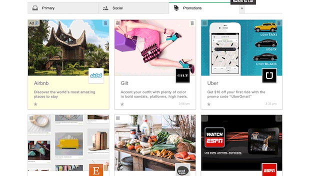
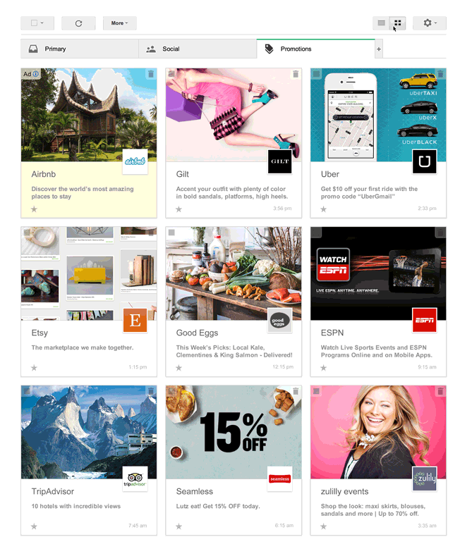
Google is at it again. Just one year after the email-giant organized the inbox into tabs, the company is rolling out another change. This time Google wants to transform the landscape of promotional emails. The company announced plans to nix their list-based look and turn the promotions tab into a Pinterest-like grid. Here’s how it’ll look:
So, how could this change the emails that you send for your business? Before we dive into the specifics, we should point out that Google is only testing this look right now. It’s not a done deal, but many marketers, like Kelly Cooper with ShopIgniter, expect it to test well.
“If we’ve learned anything from social networks, it’s that users interact more with rich content like photos and video over text, so the move to a more engaging view could create some great opportunities for marketers to make content that stands out,” she says.
If Google gives the grid view a green light, here’s what you should know:
Visuals rule
The images you select for your emails will be more important than ever. The premise behind this grid view is to show off some eye-candy. Think about what catches your eye when you’re scrolling through Pinterest or other social networks. Vivid pictures tend to grab your attention, right? You’ll want to approach your emails with the same kind of visual mindset.
Picture size matters
You’ll need to familiarize yourself with the formatting requirements, one of which is the size of the featured images. All featured images, the ones that show in the grid, must be at least 580 pixels x 400 pixels. You can use GIF, PNG or JPEG images. Animated GIFs can be used but the system will treat them as static pictures.
Character limits for sender names and subject lines
In the new format, the sender name or from label is limited to 20 characters, which shouldn’t be a big problem. That’s plenty of room for your company name, or who the subscriber expects to hear from.
The subject line is limited to 75 characters, which is about the same amount of space you have for a subject line in a regular email. However, with standard emails, a lot of businesses have perfected the art of short subject lines, about 50 characters or less. With this new view, however, some say it would be a waste of prime real estate to write short subject lines. We’ll find out which school of thought is right when small businesses run A/B tests on subject lines in the new grid view.
Sender picture pulled from Google+
A picture of the sender will also show up on this new grid view. In an attempt to get you to use all things Google, the picture comes from your company’s Google+ account. So, if you don’t have a Google+ account for your business, now might be a good time to set one up. Here’s a Google+ guide to get you started.
Sign up for the test view
There’s no word on how long Google plans to test this new view, or when it could be implemented, but you can sign up to give it a test drive. Right now this is only for emails read on a desk top, anyone seeing your emails on a mobile device will still see the standard list view. Since about 50% of emails are read on a mobile device, this means only some of your emails will be seen in this new format. Also this is only for emails that go to the Promotions tab in Gmail, if your email shows up in the Primary tab, for example, it will still be in the standard list format. And finally, even when this has been rolled out, Gmail users can toggle this view on and off, so it’s possible your emails will only be seen in this format by a handful of people.
What do you think of Google’s new grid view? How do you think it will impact your email marketing?
© 2014 – 2018, Contributing Author. All rights reserved.


 Features
 Pricing
 Partner
 Blog
Blog Support
 More
More Terms of Services
 Privacy Policy
Gradually been using gmail more and more but this is a game changer. Will be reconsidering for sure
One thing I forgot to mention, I only check Gmail messages in the Outlook desktop app anyway. I have that set to not allow images until I say so on any particular message. Outlook 2013 lets me filter out anything that I want to, so if you send me too much junk or spammy material, I won’t see it anyway because I’ll filter it to the trash. Fortunately, with Outlook I can override any of Gmail’s BS.
This is ridiculous. It makes all of your mail look like junk mail circulars. I used to like gmail, but I’ve relegated it to use only when I sign up for newsletters, or need an email address for a login that I rarely use. Google can bite my rear end. Actually, they probably know more about my rear end than I do, the way they spy.
Outlook.com has a much better layout than Gmail now, and is very customizable. Not to mention, you can turn off targeted ads and other “features” if you don’t want them (and I don’t).
I want my email. I am not interested in seeing my Facebook page photo sent out and I am not interested in a visual display. Let me filter, let me list my emails and then leave me alone.
I like the concept; however, I would prefer to have a mass ‘Delete’ feature for the ‘Promotions’ tab or anything else I don’t want to bother with.
It bothers me that gmail/google scans my email to try to target adverts. It is a violation of privacy and coupling that with their putting any and every email sent, received, replied to or forwarded in my contacts allows others like linkedIn to mine even deeper. It is typical corporate oligarchy that treads on individuals for their profit. It is past time for it all to stop. There will be a string of more lawsuits to force the issues. Why not just take the users into consideration and avoid the ugly?
please advise on this point! Maybe we can make our images part of our account on VR then the domain issue might go away? It just means Drive Space hehe
While much has been written on this topic, your article expresses both the positive and negative aspects of this important topic, without taking an boring stance on either side of the issue. Lisa Furgison, I must Thank you for your thorough research and clear writing.
I like this idea. Without question, visuals rule. Whenever I send out an email and track clicks, my image based emails are always clicked on more often. This new Google layout might make the promo tab more competitive though. Only time will tell.
Very interesting, Jeff. Thanks for the additional information! I’ll definitely pass this info along to our product people.
Cheers,
Colleen
VerticalResponse
Interesting topic. Worth noting is the fact that the featured image doesn’t have to appear in the email. Gmail provides for markup language in the headers where you can specify an image anywhere on your server to display.See https://developers.google.com/gmail/actions/reference/offer
Also, there has been some speculation that the Google+ account that supplies the logo must match the sending domain of the email (otherwise anybody could get the Bank Of America logo to appear and look very official). Not sure how this will work for VR Clients since our sending domains are usually vresp.com.
This Is Going To Make Gmail One Of The Best.I Like It.
Lately all my emails to gmail accounts have been sent to spam by gmail filters. Could this be the reason?