
Infographic Dos, Don’ts and Must-Haves
We live in an age of data, but visualizing that data and making it tell a story can be challenging: enter the infographic. Presenting complex information visually makes it that much more digestible, which may explain why infographics have surged in popularity. In fact, a single infographic has the potential of being viewed by up to 15 million people, according to Top Marketing Schools and the field of data visualization is growing both within business and academia, media and elsewhere.
New tools, easy access to raw data and social media make it practical for even small businesses and entrepreneurs to take advantage of this trend. Caitlin Rogers, communications director at data design firm Simplicity Metrics, provides some pointers for people creating visual representations of data for the very first time.
1. Don’t assume the audience is well versed in your topic.
“If you’re presenting information to a really broad audience, make sure to define the terms you’re using,” Rogers suggests.
For example, if you’re creating an infographic about heart disease, you may wish to define exactly what heart disease is before delving into how many people it affects.
2. Maintain a clear focus.
It can be tempting to try to cram every piece of information you have on your industry or customer base into an infographic. Just like when you’re writing a blog post, it’s important to limit in the amount of information in your infographic to the story you want to tell.
“Prioritize what you want people to walk away with,” Rogers recommends. “If you put too much information in, people stop paying attention, even if it’s visual.”
3. Keep the ‘graphic’ in infographic.
One common mistake is to write something out in a paragraph when you can simply use an image. “Make sure you’re visualizing everything you can. Show your story, don’t tell it,” Rogers says. At times, you’ll need to add context or information in words, “but you might be able to find an icon to go next to each sentence that corresponds to it.”
At other times, a diagram or map will work even better than pure text.
4. Make material easy to understand.
Defining key terms isn’t the only way to make your material accessible to a wide audience. Sharing context before delving into data helps, too. And having a clear reason for the sequencing of information that you’re sharing makes it far easier to digest. In addition, the way you use numbers can have a big effect. “Translate percentages into social math,” Rogers recommends. ‘20 percent of people’ become ‘one in five,’ helping the data hit home.
5. Write for your audience, not for your business.
“If you want infographics to go viral, you need to write them with your audience in mind,” something many companies miss, says Rogers. “A lot of organizations will want to create an infographic about themselves to demonstrate their effectiveness or brag about their success rate, but nobody’s going to be interested in sharing that.”
Instead, create something that’s relevant and genuinely interesting to your readers, making them far more likely to tweet out your link or share it on their own blog, LinkedIn and Facebook.
Having your organization’s branding on an infographic that’s truly useful and widely shared is a great way to get out the message that you’re an expert in the field, and is far more effective than creating an infographic all about you that nobody’s interested in looking at or sharing.
Have you created an infographic for your business? Share your successes or challenges in the comments.
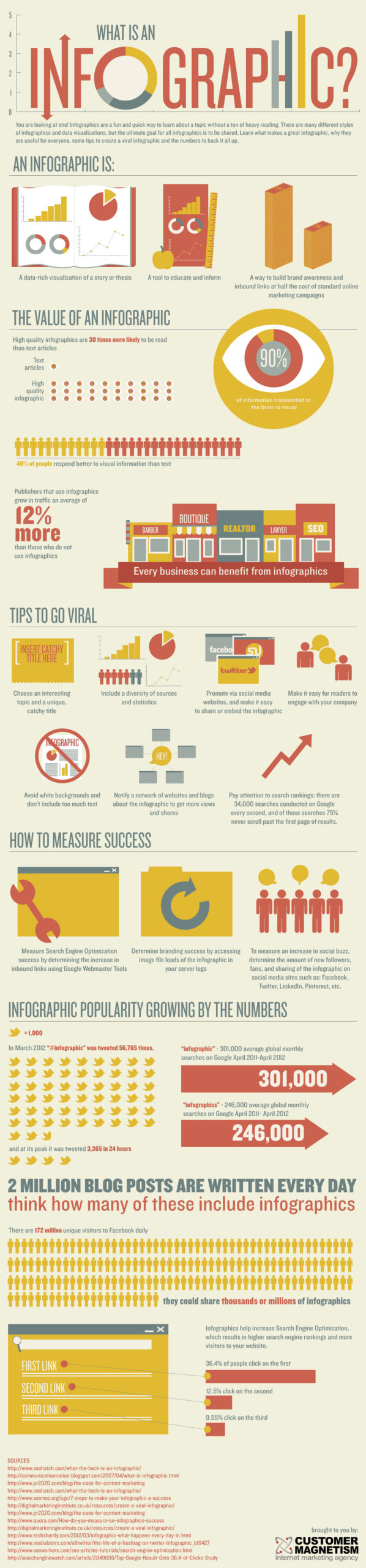
As an extra bonus here’s an infographic about infographics from Customer Magnetism:
This post contributed by guest author, Yael Grauer. Grauer is a Minneapolis-based freelance writer and editor. Find her online at Yaelwrites.com.
© 2013 – 2018, Contributing Author. All rights reserved.


 Features
 Pricing
 Partner
 Blog
Blog Support
 More
More Terms of Services
 Privacy Policy